

Source: Designed by Freepik
Responsive design has become a de facto standard for the Web; not out of some silly fad, but rather as a necessity. With mobile devices gradually overtaking the desktop as the default platform for web consumption, it’s essential for brands to adapt their content to the constraints of mobile platforms, especially when that content drives the sales. By going responsive, brands simultaneously show that they are responsible, in the sense of recognizing and accommodating the needs of their audience.
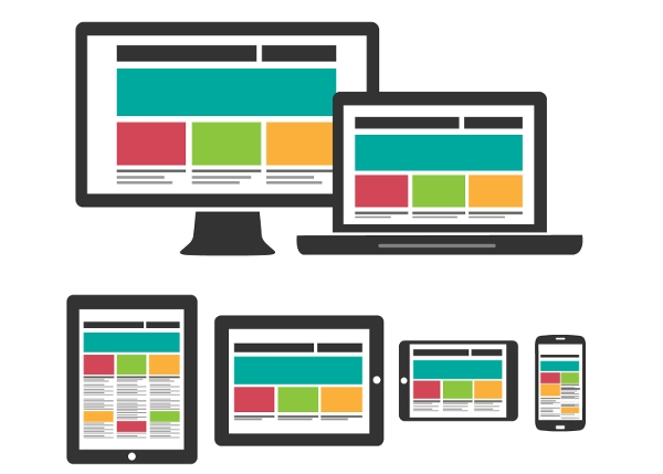
The basic principle of responsive design is easy to summarize: it’s a design approach focused on flexibility, the result of which should be content that’s equally comfortable to consume on different devices. This is achieved with the help of two crucial concepts: the fluid grid and media queries. Both are used to style the final product in a dynamic, conditional way; either by detecting the screen size and scaling the content accordingly, or by relying on relative size values of elements. When designing a responsive email, the priority should be to optimize the font size, navigation and image scaling, and make sure the layout that contains all these elements remains elastic.
Source: Designed by Freepik
The reasoning behind this is not as abstract as it might seem; in fact, there is ample data that proves how smart it is to incorporate responsive design into your email marketing campaign. Research shows that up to 65% of all email is first opened on mobile devices, and first impressions count more than ever, because email can now be accessed in all kinds of situations, including fast-paced, busy circumstances in which the decision to delete an email is made within seconds of its opening. If your email is designed to attract attention and if its layout doesn’t break on the user’s device, you are more likely to reap engagement from it.
While it could be argued that great marketing copy doesn’t need bells and whistles to get clicks and traffic (in other words, that an email marketing campaign could be successfully lead with plain-text emails), there are several benefits in designing a responsive HTML
email. It allows you to format the copy, highlight the important parts and the CTA. Moreover, links are much easier to parse in an HTML environment, so an HTML email is a clever strategy to increase engagement. Finally, it lets you implement tracking and get results that will help you improve your marketing activities.
Still, there are certain challenges and obstacles to consider before investing time and/or money in responsive email design. Although it’s 2015, email clients are still not quite in sync with web design standards or with each other, especially on mobile platforms. They support only a limited set of HTML and CSS elements and attributes, so you have to be prepared to either implement various workarounds or make some sacrifices and opt for simplicity.
However, with careful planning, analysis and helpful tools you can overcome these issues. The first stage should include collecting data about the devices your customers use to read your current, not-yet-responsive emails. Take note of which browsers and email clients they use, and on which platforms. Then work to find their common ground; find the elements that all these clients support, or take the easier route and design for the platform and software used by the majority. Apple has had great support for rich HTML emails on its iOS devices for a long time, so consider yourself lucky if your customers use it.
Apart from adapting the layout to devices, you should also adapt it to your content. Different types and forms of content should be accounted for in your marketing strategy so that the design can be shaped around and for them. It’s a good practice to keep all your designs consistent – whether it’s your website and promotional materials or profiles on social media and marketing emails. Don’t vary the fonts and colors too wildly; rather, aim to establish a visual identity for your brand.
Once you have defined all this, the next step is deciding how to translate these plans into the language of responsive design. While you might be (understandably) tempted to just transfer the entire design of your website into an HTML email, it’s much better to keep it as simple as possible. Rely on short, quality copy with smart positioning of links and CTAs instead of sending out image-heavy emails with too much text. The reason why text should be trimmed is the fact that people read emails quickly and often while they’re distracted. Your marketing emails should make it clear what your message is and what is expected of your audience. This ease of use should extend to landing pages as well. Ideally, they would be built on the principles of responsive design so that your customers can access them on mobile devices.
The production phase, i.e. the design process itself will be inevitably influenced by your designers’ skills as well as their coding and creative choices, and, among other things, it will depend on your budget. Generally, there are three ways to design responsive emails:
1) Take your regular email designed for the desktop and optimize it for mobile with the help of @media queries, hidden elements ( { display:none !important; } ) and other tricks;
2) Optimize your email marketing campaigns to have responsive email design. Don’t lose out on potential subscribers and buyers.
3) Choose a one stop shop solution for your email marketing efforts. Email marketing companies like GetResponse can help you manage your entire email marketing campaign, so they are perfect if you want to minimize costs and reduce the number of tools in your workflow. This includes dozens of responsive email templates to choose from.
Whichever path you and your designers choose, there are some basic guidelines to follow:
- Buttons are always a better choice than links because they’re easier to interact with on mobile devices. They can be styled to look attractive and immediately grab the reader’s attention, which is great for CTAs. When it makes sense, use buttons.
- When using links, make sure they’re not positioned too close to each other. The target area for both links and buttons should be between 44 x44 and 48×48 pixels.
- Don’t forget about readability. Just because the screens on mobile devices are small doesn’t mean the text should be small, too. Minimum recommended font size is 16px; naturally, titles and subheadings will be larger than body text.
- Instead of adding more images to use as icons, keep your email lightweight by relying on icon fonts. They will scale better and usually faster than images.
- Be careful with media queries and CSS. To make your responsive email work in the majority of mobile email clients, you will have to inline all CSS. Media queries need to override the default CSS, so you should declare all @media rules as !important.
Even if you follow all the advice you can find, there is still a chance that your responsive HTML emails won’t work well on some devices. To minimize the risk of this happening, make sure to test thoroughly before launching the email campaign. Test many times, on as many different devices, platforms and clients as possible. When you’re done testing, test some more. Your customers will be grateful for mobile-optimized content, and you can expect measurable positive effects of a switch to responsive email marketing.