Ever since I began surfing on the web (it’s been well over a decade now), I’ve considered search essential. More so, on sites with a large amount of content, I find myself searching within the site for ease of locating results, especially because even before I understood what SEO was, I knew that not every page was being necessarily crawled by the search engines. Consequently, I put a lot more faith in the on-site search rather than the results spit out by search engines.
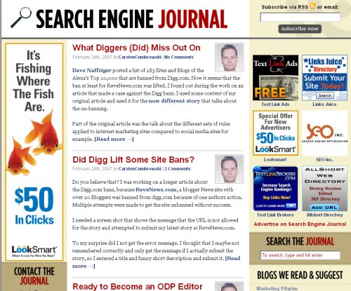
I’ve found myself time and time again searching for a term in the email subscription textbox, only to realize after I performed the search that I actually searched within the “subscribe” textbox, which is above the fold. The “search” textbox is on the site, but it’s below the fold (which takes searching for, sometimes!)
I don’t know about others, but while I understand the desire to stick the subscribe button where it’s easily found, I don’t think it does much for usability. And usability should come first. It makes me feel that the web designer forgot to keep the user in mind because the goal is an immediate conversion rather than satisfying the user’s needs.
Here’s an example:

SearchEngineJournal, which was recently redesigned, has the “Subscribe” textbox on top, and only when I scroll down (on my laptop with 1280×800 resolution) do I find the Search button. Since SEJ happens to have a large amount of great content (I suppose it averages 5-10 posts a day), I personally have seen the need in the past to search easily and quickly. I don’t think the current layout is friendly for that purpose.
On the other hand, here’s a site that’s gotten it right:

The search is on the top of the page and the subscribe button is right below. Much further down, a user can sign up for emails if s/he chooses to do so.
Since most of us use RSS feeders anyway, I don’t even see the need to make the email subscription link as apparent.
I am curious to know whether the placement of the “subscribe” button on the top of the page has actually yielded more conversions than if it was in the middle of the page. I’d also be curious to know whether people fall victim to searching in the wrong textbox or if I am the only zombie to do such a silly thing. 🙂 Does anyone have a preference about this? It seems that it is not often discussed (if ever), though I always catch myself before I make the mistake. In my case, I am always performing a search, and because of this, I believe that it is in the users’ best interests to put the search button where they can find it.


So what you think of the new design and implementation of the subscribe button at Search Engine Roundtable?
I should have said something sooner, Barry — so sorry about that. I love the new design and the integration of Google Custom Search is pretty neat. 🙂 Perfect location, especially with the RSS button right underneath!
Tamar,
Good question!
One main emphasis of web usability is on high quality content. If you have the opt-in box above the fold I don�t believe you�re neglecting the user. The catch is you must provide the user high quality information via their subscription. Most posts, books, and articles also recommend an opt-in box above the fold. Maybe consider adding a text link to the end of each article. As long as you�re providing the user value without forcing them to sign-up go for it.
Eugene, this is a good point. I think, though, that most people want to use the website for search rather than a sign-up which is a one-time event. I find myself visiting sites such as SEJ often for the specific reason for search. Since I already am an RSS subscriber, I don’t need to sign up for their mailing list. In my eyes, usability is about paying attention to what the users will utilize frequently, rather than once (if ever).
Thanks Tamar…
Was just curious what you thought of our implementation.
Thank you!
Hi Tamar,
Good point. As a site search vendor I see this all the time. I’ll often go to a site just to check out their site search and start typing in the wrong text box. I often wonder how many others do the same thing.
In many cases the site has a newsletter that they are trying to get people to subscribe to – so they still need the text box for the email address.
If you are going to have text boxes other than the site search then another good idea is to add some cues as to what is expected in the box. For example at Blair the newsletter sign up box has at least 3 cues hinting that you should put an email address into the box – the envelope image above it, the text in the box, and the dummy email address below it.
Well, perhaps it’s me, but I’m drawn to the white textbox at times — the clear indications around the box would hardly make much difference. 😉 The Blair website does do it right with the email in the middle of the page and the search on top. Above the fold is where it’s at for me.
Again, if email signup is a one-time event, it really shouldn’t be in our faces in lieu of a search function. I would say that in the case of Search Engine Roundtable with the search on top of the RSS signup form (equivalent of email for my purposes), this is a perfect way of putting both above the fold while keeping the site owner and the users in mind.
Guess I found this post a bit late as it seems you now have the subscription box above the fold. Lol It looks awesome there and you gave me a great idea to add the search on top of the left category.
I just realized you are from the same borough. Nice!